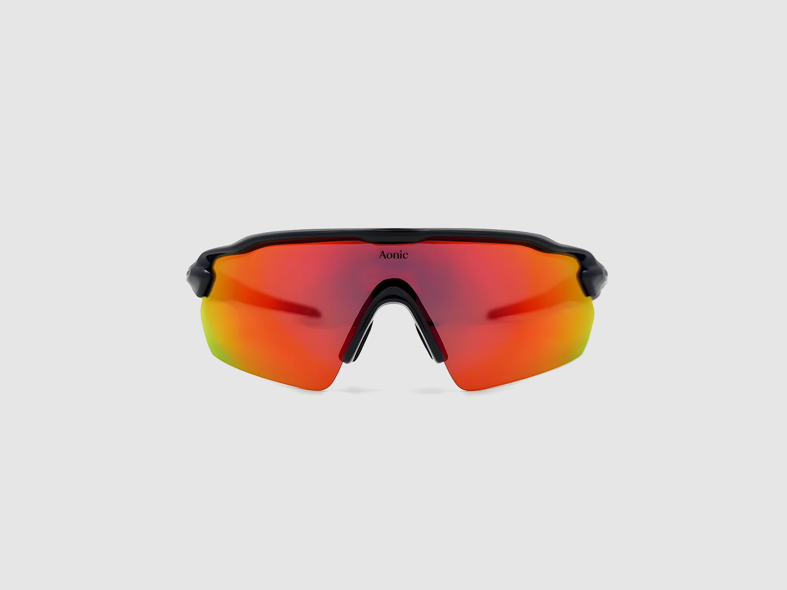
Aonic Inc.
Led the strategic positioning and full identity development for Aonic, a tech-first San Francisco wellness startup creating clean, science-backed tools for daily living.
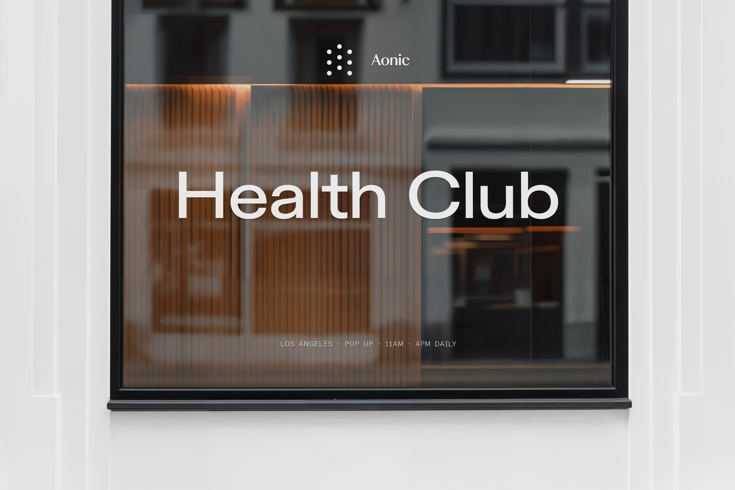
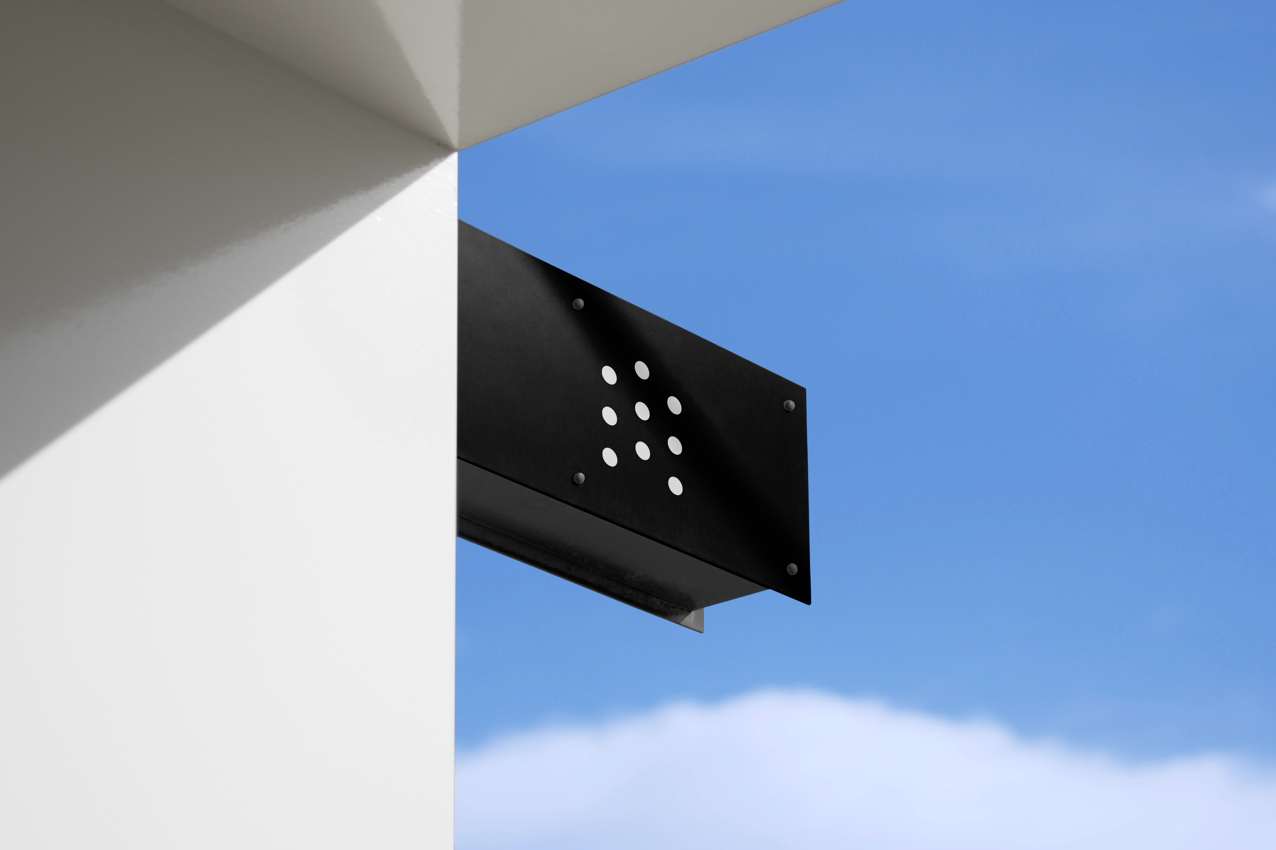
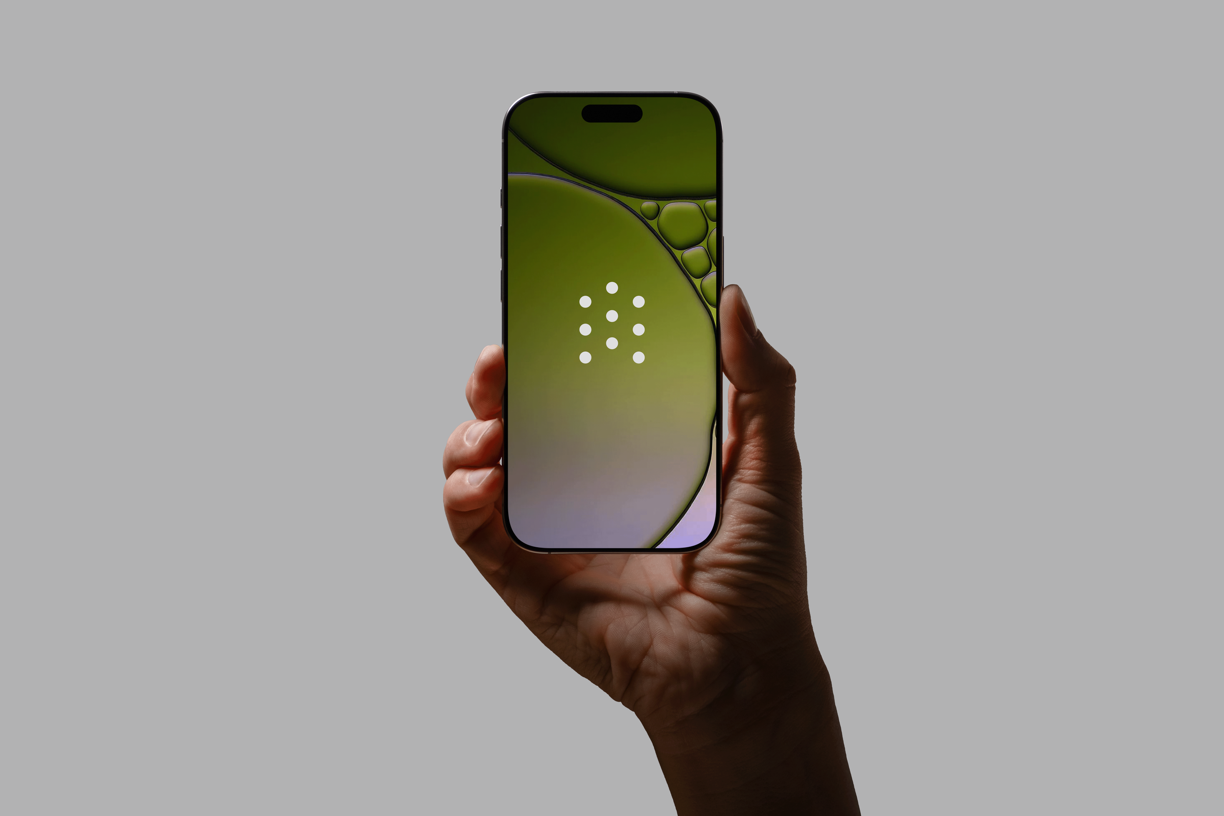
Logomark
The logomark reflects Aonic’s technical, wellness-driven positioning. Built from minimal geometry, it communicates clarity and precision. The dots form upward arrows that suggest progress while subtly creating an “A.”

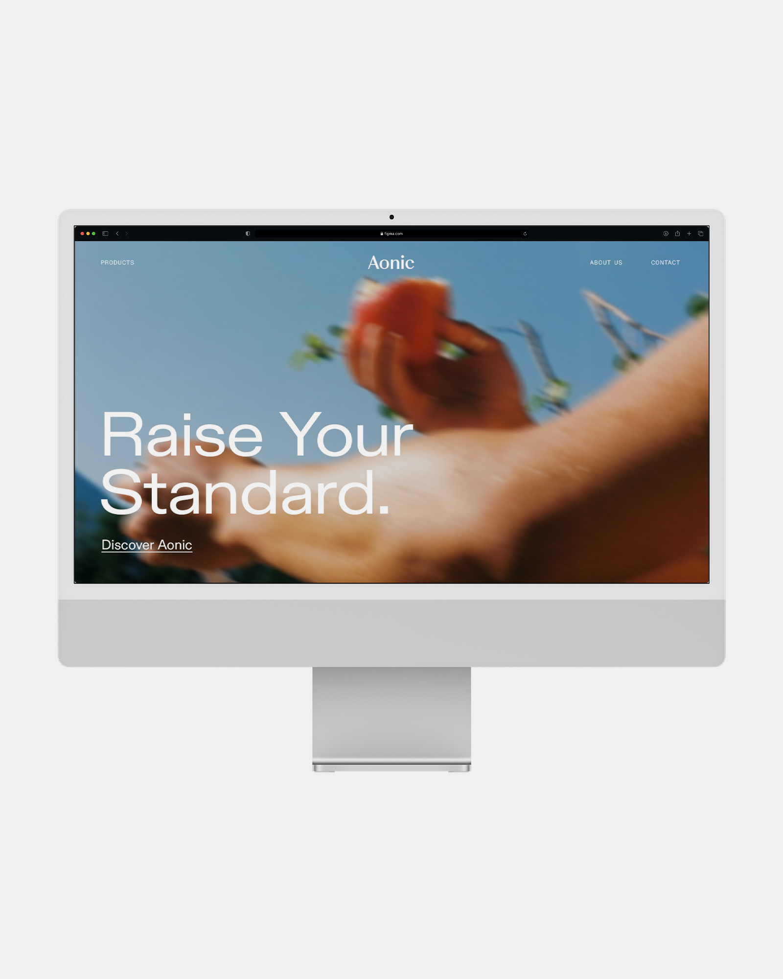
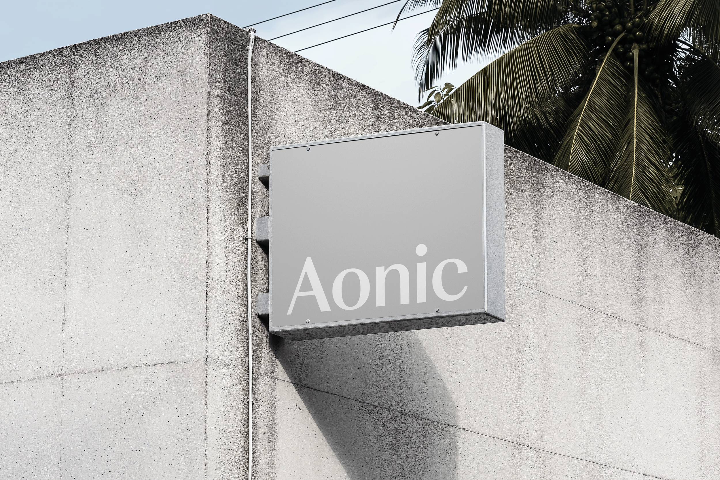
Wordmark
The wordmark supports the goal of blending tech and wellness. We moved away from a pure sans-serif look, which felt too tech-driven, and chose Weave by Colophon for its balance of serif and sans qualities. The softer details give the brand a modern yet human feel.
Typography
Aonic’s type system uses three cuts of ABC Dinamo’s Diatype to express a modern, tech-driven nutrition brand. Regular carries the body text, Extended leads the headlines with clarity, and Semi-Mono adds a precise, technical edge where needed.